One of the most important functions of packaging is to instill confidence in a purchase. You want customers to feel like they’ve made the right choice when they buy your product. And even more than that, you want them to feel better for having bought it.
You might not associate custom boxes with medicine. You’re probably used to translucent orange pill bottles for your prescriptions or maybe an opaque plastic tub for your dietary supplements. That kind of medical packaging design doesn’t exactly inspire enthusiasm.
The simple choice of packaging medicine in a premium paperboard box changes the perception of prescriptions from a health need to an esteem-boosting lifestyle improvement. Packaging can help patients feel better about getting well. Just ask Bayview Pharmacy.
From Bayview to You
Bayview Pharmacy is a Rhode Island-based compounding pharmacy specializing in creating custom prescriptions. Founded in 2006, Bayview has served over 30,000 patients in Southern New England with medicine tailored to their unique needs. Among Bayview’s many specialties are men’s health solutions, provided in conjunction with their sister company, Zested.
Lead by a team of renowned physicians, Zested offers a comprehensive range of men’s health solutions including male vitality supplements and lifestyle improvement resources. Centered around a holistic approach to treating one of the most common health challenges facing men, Zested is focused on creating lasting outcomes.
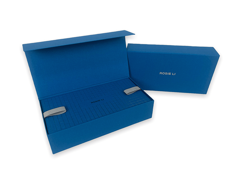
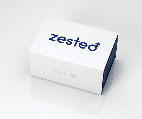
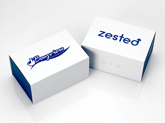
To box up custom pharmaceuticals from Bayview Pharmacy and Zested, we developed two versions of a custom medical packaging experience. Let’s start with a look at this Tray in Sleeve box for Zested.
Design is the Best Medicine
This design maximizes minimalism, carefully balancing the space of the box with just enough decoration. It’s spare in its layout. And yet despite the minimal aesthetics, this box speaks volumes about Zested. If you had no idea what this product was, you could venture a guess based on the packaging – and you’d probably be in the ballpark.
There is a masculine motif present throughout the design, from the Mars symbol (♂) in the Zested logo to the deep blue color of the foil and tray. While there are plenty of questionable, dubious, even downright dumb examples of product packaging for men, the gendered theme of this box goes a long way to normalize the issue at hand. It’s a distinctly male problem, and so, the design benefits from being distinctly male.
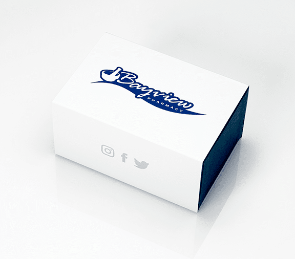
The Bayview Pharmacy version of this Tray in Sleeve box uses much of the same structural design with a slight modification to decoration. The distinction is the logo. The Bayview logo is rendered in the same blue foil as its Zested counterpart, echoing the Bayview brand colors.
A Dose of Color
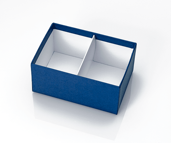
The colors of the box distinguish the separate components. Rainbow Paper in Navy from Ecological Fibers wraps the tray. It’s a sturdy blue tone that evokes masculinity – a tone that’s especially appropriate for Zested. The dark blue of the tray contrasts against the white sleeve, differentiating parts of the box and inviting interaction. It’s not only a manifestation of brand identity but a cue to the functionality of the box itself.
Custom foil stamping, one of the most versatile decorations we offer, adorns the front of each box. As always, the hot foil is applied with the utmost precision, rendering every character in clean, consistent lines. The pearl white sleeve accentuates the decorative foil, making for a dynamic visual experience.
Social media attribution is a critical part of this design, present on either side of the sleeve. Rather than using the branded blue foil, the various social insignias are stamped in metallic silver.
This simple difference in color goes a long way to make the exterior feel less crowded. The metallic foil practically disappears into the white sleeve as light catches it, opening up the design and putting emphasis on the respective Bayview and Zested logos.
You don’t always need the bells and whistles to make the best box for your brand. Sometimes, great packaging is doing the most with less. Providing a much-needed dose of personality in medical packaging, these boxes for Zested and Bayview Pharmacy maximize minimalism for a distinct branded packaging experience.
Need custom medical packaging design & manufacturing? Start your packaging project today!