You can shield your eyes from bright light, hold your breath to avoid an awful smell, but loud noises are practically impossible to escape. The auditory hazards of our day-to-day lives are abundant, though generally not harmful enough to impact our quality of life. The more we expose ourselves to dangerous decibels, the more we put our hearing in peril.
Some of us work daily in settings which are downright oppressive to the ears- banging, booming, shrieking metal-on-metal. Slowly, but surely, it takes a toll. In fact, 48 million Americans live with hearing loss in the United States today stemming from a variety of causes, from occupational to recreational.
But the severity of hearing loss and rate at which we lose our sense of sound is in our control more than we realize. That’s where earplugs, earmuffs, and other forms of hearing protection come into play. To defend against occupational hearing loss and the aural assault of modern life, Howard Leight and Bilsom have developed an impressive series of hearing protection hardware.
Howard Leight is a leading brand of contemporary hearing protection offering an expansive array of products suited for almost any conceivable noisy environment; for everyone from industrial workers to front row headbangers. Their products include both disposable and reusable earplugs. Similarly, Bilsom makes a variety of protective earplugs and earmuffs. The two brands came together in this kit for a supreme sampler of hearing protection hardware.
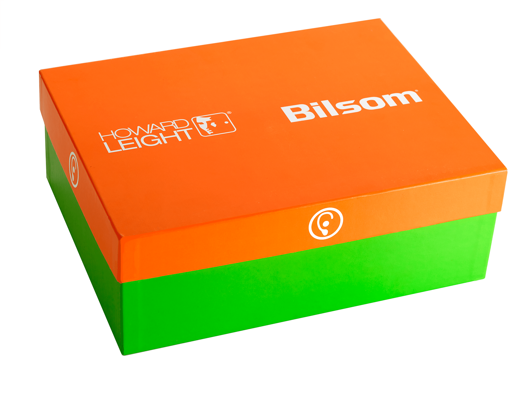
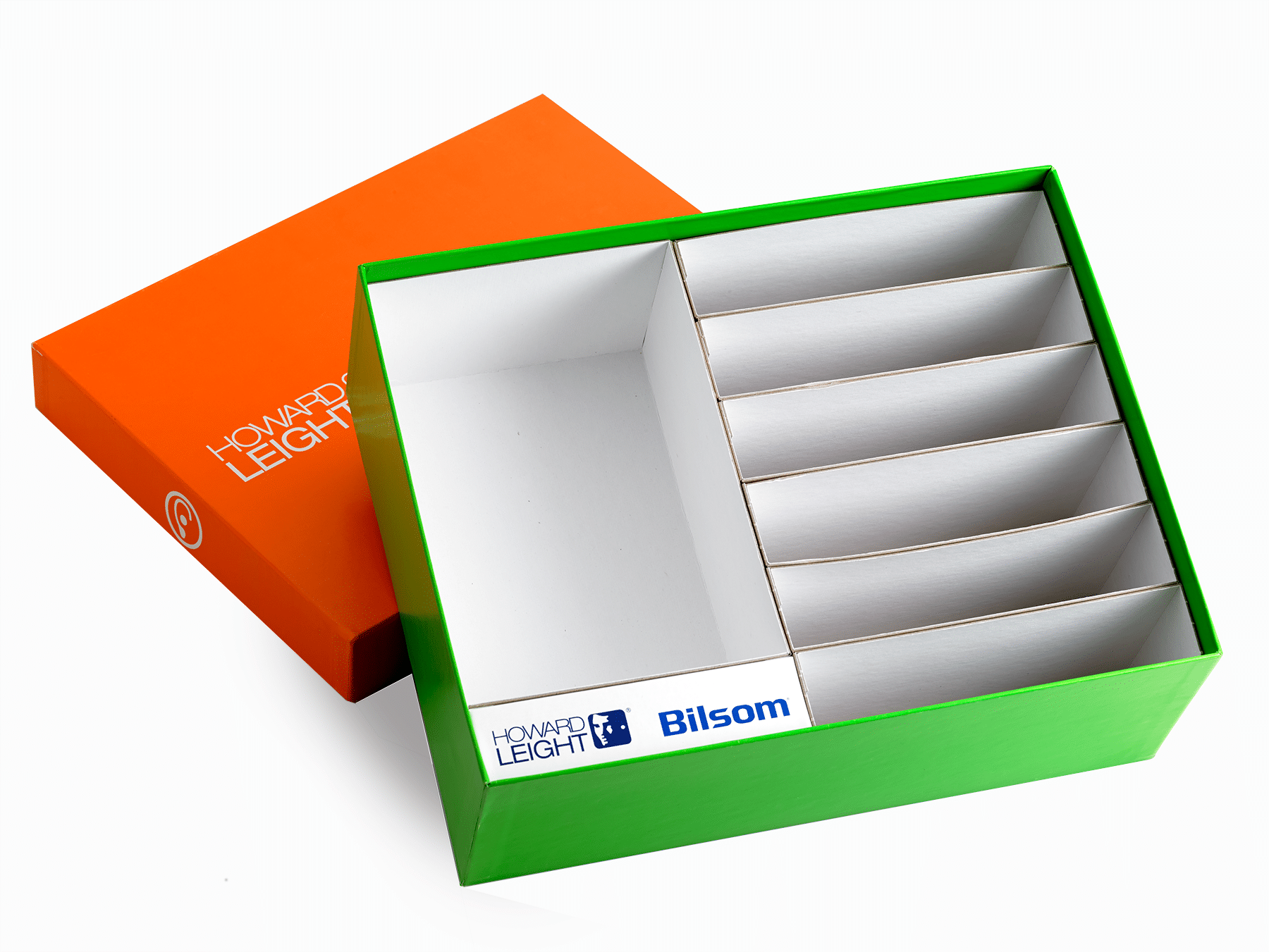
We worked with Howard Leight and Bilsom to create a one of a kind sales kit that embodied the modern sensibilities of the brands and showcased their product offerings. By all appearances, this is a typical base and lid box – maybe a little more colorful than usual. But once the lid is removed and the interior can be examined, this box quickly defies expectations and reveals a comprehensive packaging experience.
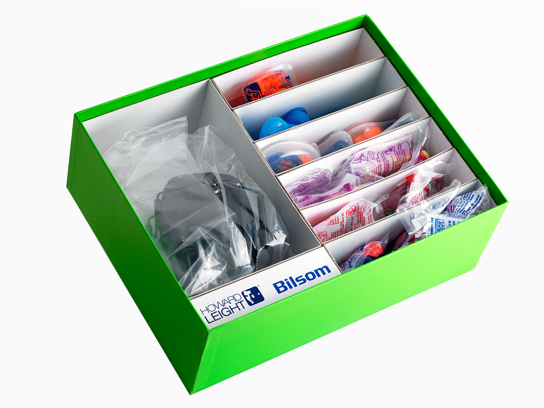
You could argue that this box is really eight in one. There are seven unique trays loaded into the base of the box; six for the Howard Leight earplugs and one for the Bilsom earmuffs. Each of these trays are composed of white vat board and fit into the larger base with utmost precision.
The arrangement of the trays took some finessing. Seven perfectly symmetrical containers had to be coordinated within a fraction of an inch, sizing each piece to precisely fill out the base. The individual trays keep the sample products separated and organized. To ensure a perfectly flush fit for every tray, a copy bar was added with the Howard Leight and Bilsom logos printed in PMS and treated with gloss varnish- a branding touch-point that makes clever use of the remaining space in the base not occupied by the vat board trays.
 The brilliant colors of this box are achieved thanks to an offset PMS decoration with matte varnish, a decorative technique which renders incredible color saturation and brightness. The main advantage of a PMS color system versus a 4C (or CMYK) is the ability to match an exact color without compromising brightness or depth. The specificity of color brings out the ultimate branded expression of the packaging, allowing for perfect coloration aligned with brand standards.
It’s worth pointing out that for a box made to contain various forms of hearing protection, these colors are loud. Outrageously so. They clash a little bit, the green and orange tones are almost unnaturally bright – but that’s what makes this design all the more brilliant. You can’t escape these colors, they don’t fade into the background, they stick out and command attention. They’re loud.
The logos on the exterior of the lid received a spot gloss varnish to add some punch to the packaging. In contrast to the matte finish of the cover wrap, the gloss decoration gives each branded aspect of the box prominence. Bold coloration is crucial to the success of this design, not only in grabbing attention, but in framing the branded aspects of the packaging. Bright glossy logos stand out against the saturated colors of the wrap.
The standard base and lid is a design we’re all familiar with. It’s probably the rigid paperboard packaging we’ve encountered most in our lives. This box exemplifies the design potential of the base and lid; a comprehensive packaging experience for several products, housed under the auspices of a single box.